Looks Off? Maybe It’s Just Randomness
Exploring Calibration and Sampling Variability Using Streamlit
11/5/20255 min read
When working with probabilities or model outputs — such as predicted probabilities of default (PDs) in credit risk — we often encounter situations where results look suspiciously off. For instance, a group of loans with predicted PDs around 20% might end up showing an actual default rate of 25%, and we immediately start questioning the model’s calibration.
But sometimes, those differences aren’t signs of a bad model — they’re just the result of random variation when the sample size is small. Even a perfectly calibrated model will produce noisy results in limited data.
In this article, we’ll explore this idea using a simple uniform simulation. We’ll see how the observed proportion of events (like defaults) fluctuates around its true expected value, and how that fluctuation shrinks as the number of samples grows — a direct, visual example of the Law of Large Numbers in action.
We’ll then connect this to PD calibration, showing why understanding the underlying probability distribution matters, and why the simulation helps interpret calibration plots that might otherwise seem “off.”
From Bernoulli to Binomial — and How It Connects to PD Calibration
1. The Bernoulli trial
A Bernoulli trial is the simplest kind of random experiment. It has only two possible outcomes: success (the event happens) or failure (it doesn’t).
The probability of success, p, is fixed and each trial is independent of the others.
Every time you flip a coin, take a medical test, or observe whether a loan defaults, you’re running a Bernoulli trial. It’s the most basic building block for understanding randomness in binary outcomes.
2. The Binomial distribution
Now imagine repeating that Bernoulli trial many times — for example, checking a group of loans that each default independently with the same probability p.
If you count how many “successes” occur (how many loans default), the total number follows a Binomial pattern. On average, you’ll get a number close to what you’d expect — n × p — but any single sample will fluctuate randomly around that expectation.
Looking at the proportion of successes (defaults divided by total loans) shows the same thing: the proportion wiggles around the true probability p, and those wiggles get smaller when you have more samples. With large enough samples, this proportion forms a smooth, bell-shaped (approximately normal) distribution centered on p.
3. How the uniform simulation fits this idea
In the uniform simulation, each random draw between 0 and 1 is just another Bernoulli trial in disguise.
We define a success as any draw below a chosen threshold t. Each draw has a probability of t to succeed, and all draws are independent.
Counting how many draws fall below the threshold gives us the same kind of random variation as counting defaults in the Binomial example. The simulation perfectly fits the Bernoulli–Binomial framework — it’s a clean, visual example of how sample proportions fluctuate around their expected value purely due to randomness.
4. How loans almost satisfy the same idea
In credit portfolios, each loan either defaults or doesn’t — so each loan outcome is also a Bernoulli trial.
The difference is that not every loan has the same default probability: each has its own predicted PD.
When we sum up defaults across loans, we’re combining many Bernoulli trials with slightly different probabilities.
If we group loans into a narrow PD bin — say, those with predicted PDs between 10% and 11% — then all the loans in that bin have similar probabilities. In that case, the whole bin behaves almost like a simple Binomial process with one average PD.
This is what makes calibration analysis possible: we assume that within each bin, the predicted PDs are close enough that we can treat them as sharing the same probability. It’s a small simplification that works remarkably well in practice.
5. Why the analogy works
The uniform simulation shows what happens under ideal conditions — where every observation is independent and identically distributed.
Real credit portfolios don’t behave quite that neatly. PDs vary slightly between loans, and defaults are often correlated because loans share exposure to the same economic factors.
That correlation means the real-world variability is usually larger than in the idealized simulation. Still, the simulation provides a valuable baseline: it shows how much variation we would expect if loans were independent and had identical default probabilities.
Understanding that baseline helps us see that some apparent miscalibration — small differences between predicted and observed default rates — might not be model error at all, but simply the randomness that comes with finite samples.
Note: It’s crucial that the quantity you simulate follows the same or at least a similar underlying distribution as the real statistic you’re comparing it to. The uniform simulation works because its structure mirrors the Binomial behavior of default rates — but if the distribution differs, the comparison loses its meaning.
Building a Simple Simulation in Streamlit
Streamlit provides a convenient way to build interactive web applications directly from Python.
The following script implements the simulation and visualization described above, including an additional graph that shows the distribution of the simulated proportions.
To start the Streamlit application (app.py), open a terminal, navigate to the project folder, and run the command:
streamlit run app.py
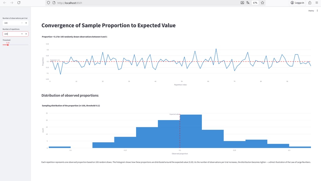
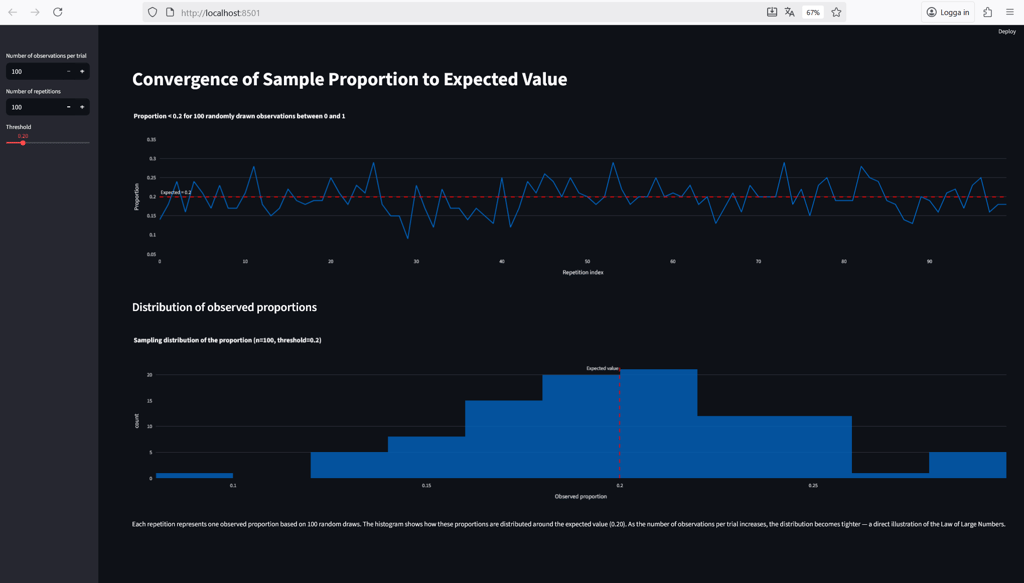
After a moment, Streamlit will display a local URL in the terminal — open it in your browser, and you should see something like this:
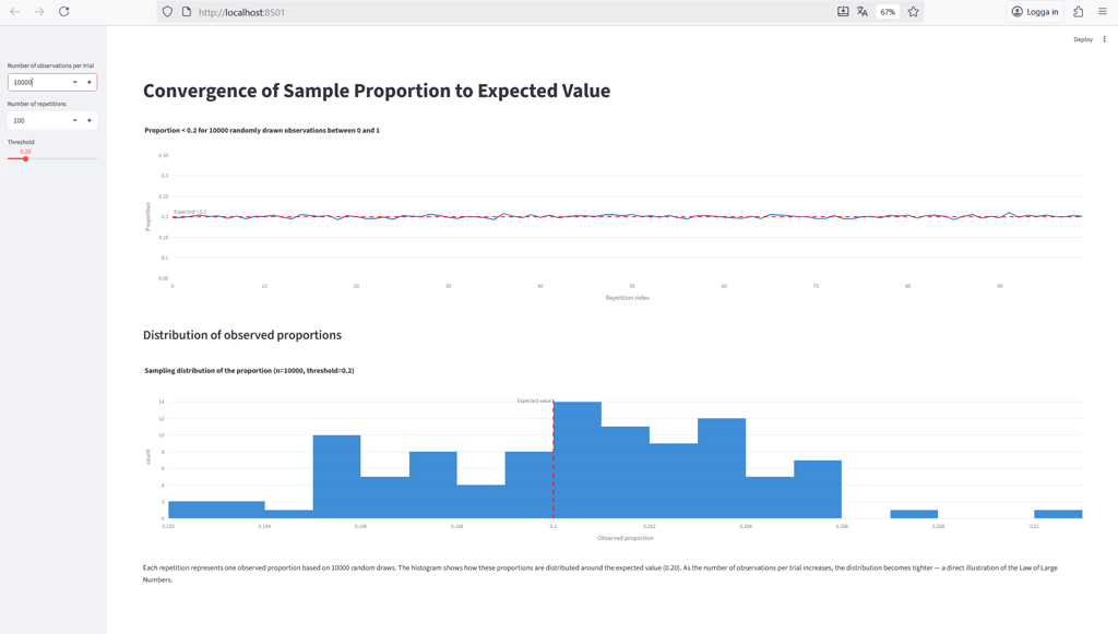
At the top left, you can control the number of observations per trial — this determines how many random values are drawn from the uniform distribution to calculate the proportion below the selected threshold. The threshold, set by the slider (default: 0.2), defines what counts as a “success” in each trial.
The number of repetitions specifies how many times the experiment is repeated. These repetitions appear along the x-axis of the top chart, which shows how the observed proportion fluctuates around the expected value across repeated trials.
The bottom chart displays the sampling distribution of those observed proportions — one data point for each repetition. It illustrates how the results are spread around the true value and how that spread becomes narrower as the sample size increases.
As shown in the figure above, with only 100 observations per trial, the sample proportions still fluctuate noticeably around the expected value. It’s a good reminder that we often need far more than the “at least 30 observations” rule of thumb from basic statistics courses.
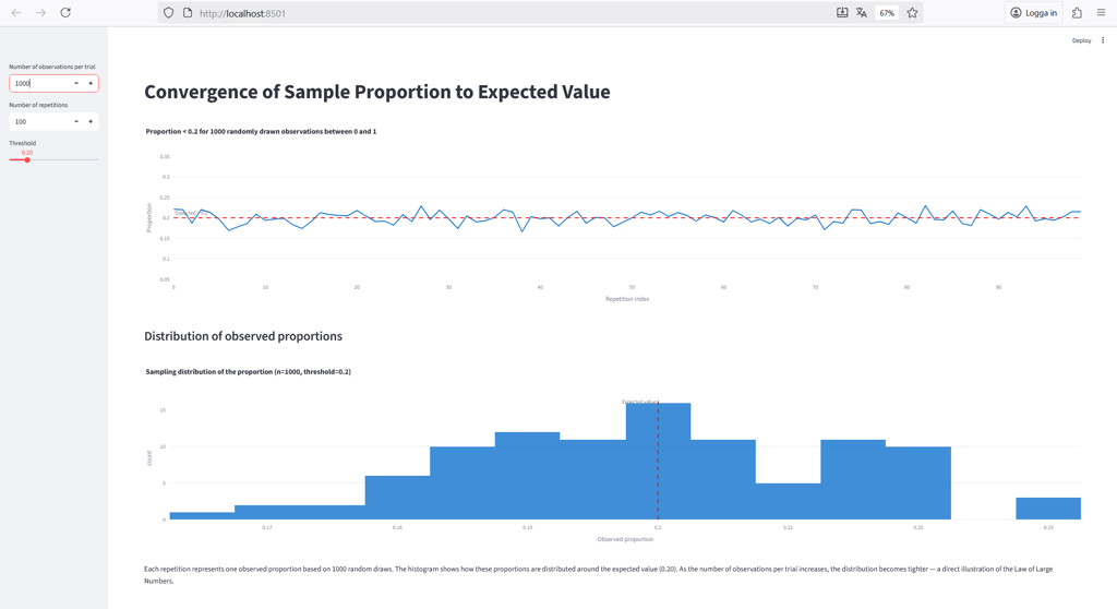
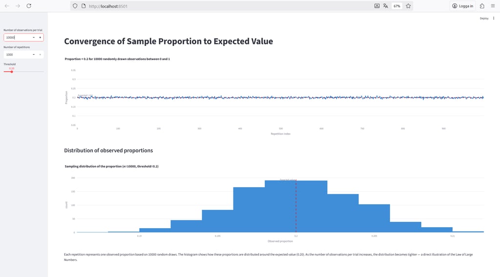
Below, we repeat the same simulation with 1,000 and 10,000 observations per trial, respectively.
With 10,000 observations per trial, the sample proportions come very close to the true expected value.
Finally, let’s examine what happens to the sampling distribution when we increase the number of repetitions to 1,000 — it should, in theory, begin to resemble a normal distribution, as predicted by the Central Limit Theorem.
The figure above confirms that this is indeed the case.
In Summary
In this article, we explored how random variation alone can make well-calibrated models appear “off.”
Through a simple simulation, we saw how the observed proportion of events fluctuates around its expected value, and how those fluctuations shrink as the number of observations grows — a direct illustration of the Law of Large Numbers.
We also discussed why the underlying distribution matters: the simulation only holds as an analogy for PD calibration when it follows the same basic statistical structure.
Finally, we demonstrated how easy it is to build and visualize this concept interactively using Streamlit.